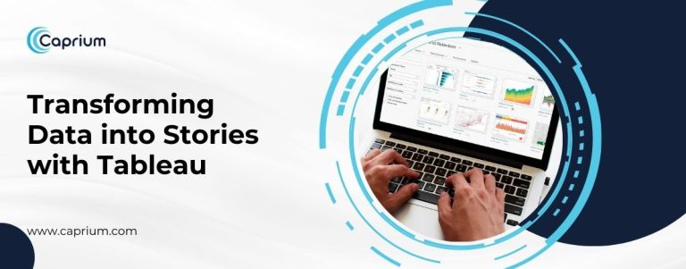
In today’s data-driven world, transforming raw information into actionable insights is a critical skill. Tableau, a leading data visualization and analytics platform, excels at turning complex datasets into compelling stories.
By blending advanced Tableau data visualization techniques, interactive dashboards, and analytics tools, professionals across industries can drive decisions, enhance collaboration, and spark innovation.
What is Data Storytelling, and Why is it Important?
Data storytelling with Tableau goes beyond presenting numbers; it’s about weaving a narrative that resonates with stakeholders. With the right visuals and context, you can convey complex insights in a way that’s easy to understand and act upon. The fusion of data visualization with storytelling allows organizations to communicate findings effectively, make evidence-based decisions, and inspire change.
For example, a financial analyst might use Tableau to craft a dashboard showcasing quarterly sales performance, blending charts, maps, and filters to highlight trends. This approach transforms static reports into interactive, actionable tools that engage the audience.
How Tableau Facilitates Data Storytelling
- Powerful Data Visualization Tools
Tableau is synonymous with intuitive and impactful data visualization. Its drag-and-drop interface enables users to create diverse charts, graphs, and heatmaps that simplify complex data. By leveraging color schemes, size variations, and dynamic elements, Tableau visualizations make patterns and outliers evident at a glance.
For instance, marketing teams can use Tableau to visualize customer demographics, mapping out audience segments and identifying lucrative markets. These visual insights streamline strategy formulation and enable swift pivots when necessary.
- Interactive Tableau Dashboards
Static charts are a thing of the past. Interactive Tableau dashboards empower users to explore data in real-time. Filters, drop-down menus, and dynamic sorting allow viewers to customize their experience and focus on specific metrics relevant to their needs.
Imagine presenting a sales performance dashboard to stakeholders. With Tableau, they can filter by region, product category, or time period, drilling down to the most pertinent information. This interactivity fosters deeper engagement and understanding, making the data story more persuasive.
- Comprehensive Analytics Tools
The robust Tableau analytics tools enable users to uncover hidden trends and correlations. Features like trend lines, forecasting, and clustering enhance the ability to draw meaningful conclusions. Additionally, Tableau’s integration with machine learning models expands its analytical capabilities, enabling predictive insights.
For instance, a healthcare provider could use Tableau to predict patient admission trends, combining historical data with predictive algorithms. By visualizing these forecasts, decision-makers can optimize resources and improve patient care outcomes.
- Cross-Platform Accessibility
Data stories often need to be shared across teams and organizations. Tableau ensures seamless collaboration through its cloud-based services and mobile-friendly dashboards. Whether in a boardroom or on a smartphone, stakeholders can access and interact with the same insights.
This accessibility is invaluable in remote or hybrid work environments, enabling teams to collaborate effectively regardless of location.
Best Practices for Data Storytelling with Tableau
To create impactful stories with Tableau, consider the following best practices:
Define Your Audience: Tailor your dashboard design and storytelling approach to meet the needs of your audience. Executives might prefer high-level overviews, while analysts may require detailed insights.
Keep It Simple: Avoid cluttered dashboards by focusing on key metrics and using whitespace strategically. Simplicity enhances comprehension.
Leverage Interactivity: Incorporate filters, tooltips, and drill-downs to let users explore the data themselves.
Provide Context: Add annotations, captions, or narrative elements to explain trends and insights clearly.
Test and Iterate: Share prototypes with a small group, gather feedback, and refine your dashboards for maximum impact.
Real-World Applications of Tableau Data Visualization
Retail
Retailers use Tableau to analyze sales trends, customer preferences, and inventory management. Interactive dashboards enable store managers to adapt quickly to changing market conditions.
Healthcare
In healthcare, Tableau visualizations track patient outcomes, resource allocation, and disease spread. By storytelling with data, providers can communicate findings effectively to both clinical teams and policymakers.
Finance
Financial institutions rely on Tableau to monitor KPIs, forecast market trends, and mitigate risks. The tool’s advanced analytics provide a competitive edge in decision-making.
Conclusion
Transforming data into stories with Tableau is a game-changer for businesses and individuals alike. Its intuitive design, powerful analytics, and interactive features make it the go-to platform for crafting compelling narratives.
By mastering Tableau data visualization, leveraging interactive Tableau dashboards, and utilizing Tableau analytics tools, you can unlock the full potential of your data and drive meaningful outcomes.
Ready to elevate your data storytelling? Dive into Tableau today and start turning raw data into actionable insights that inspire action.